Financial Dashboard Concept
Redesigning a dashboard to be data-first for investors
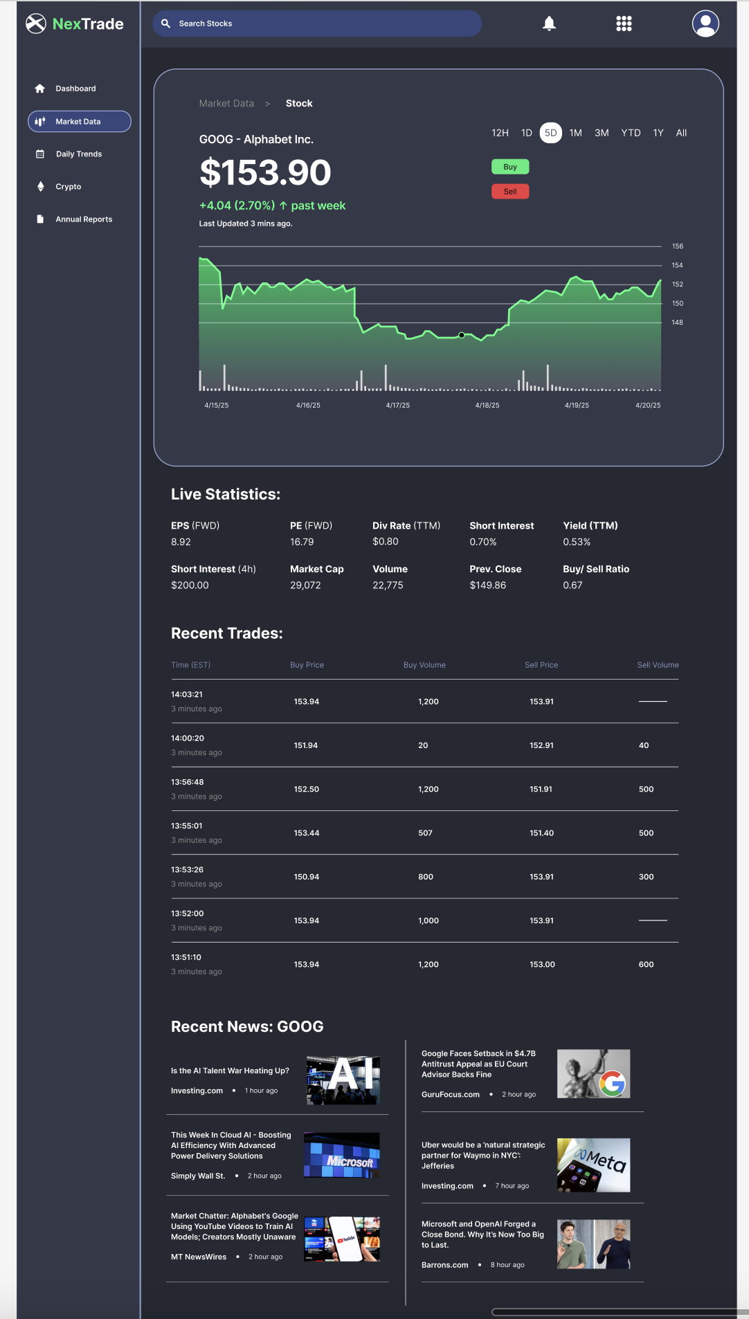
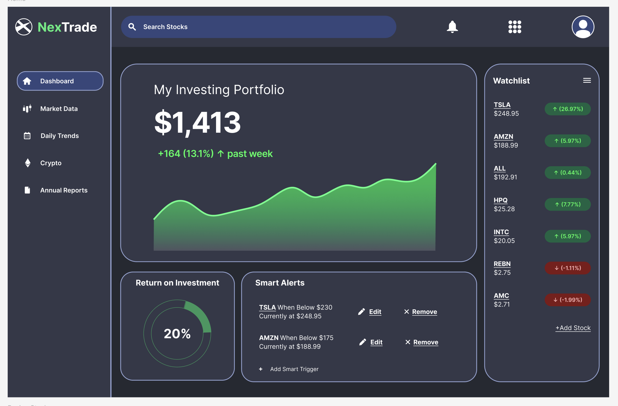
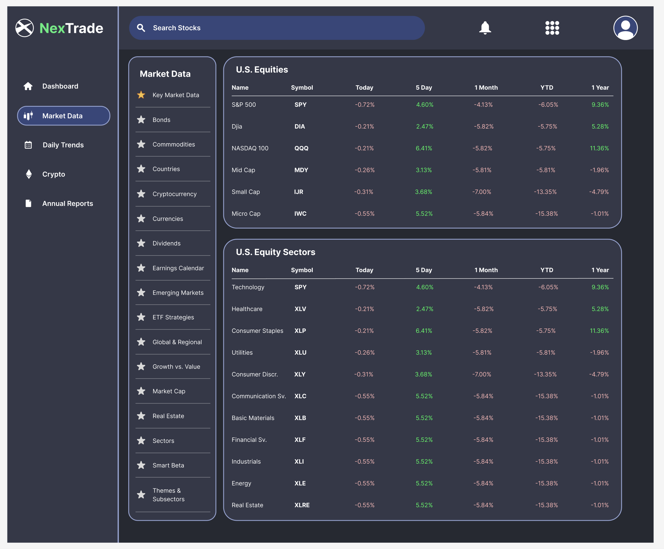
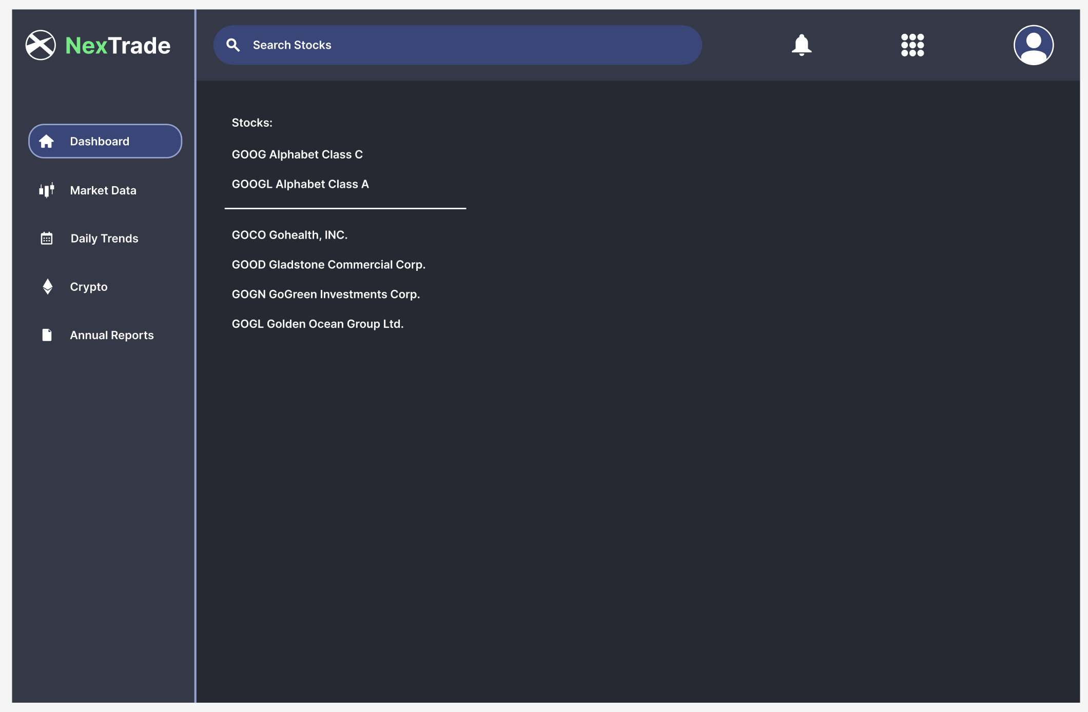
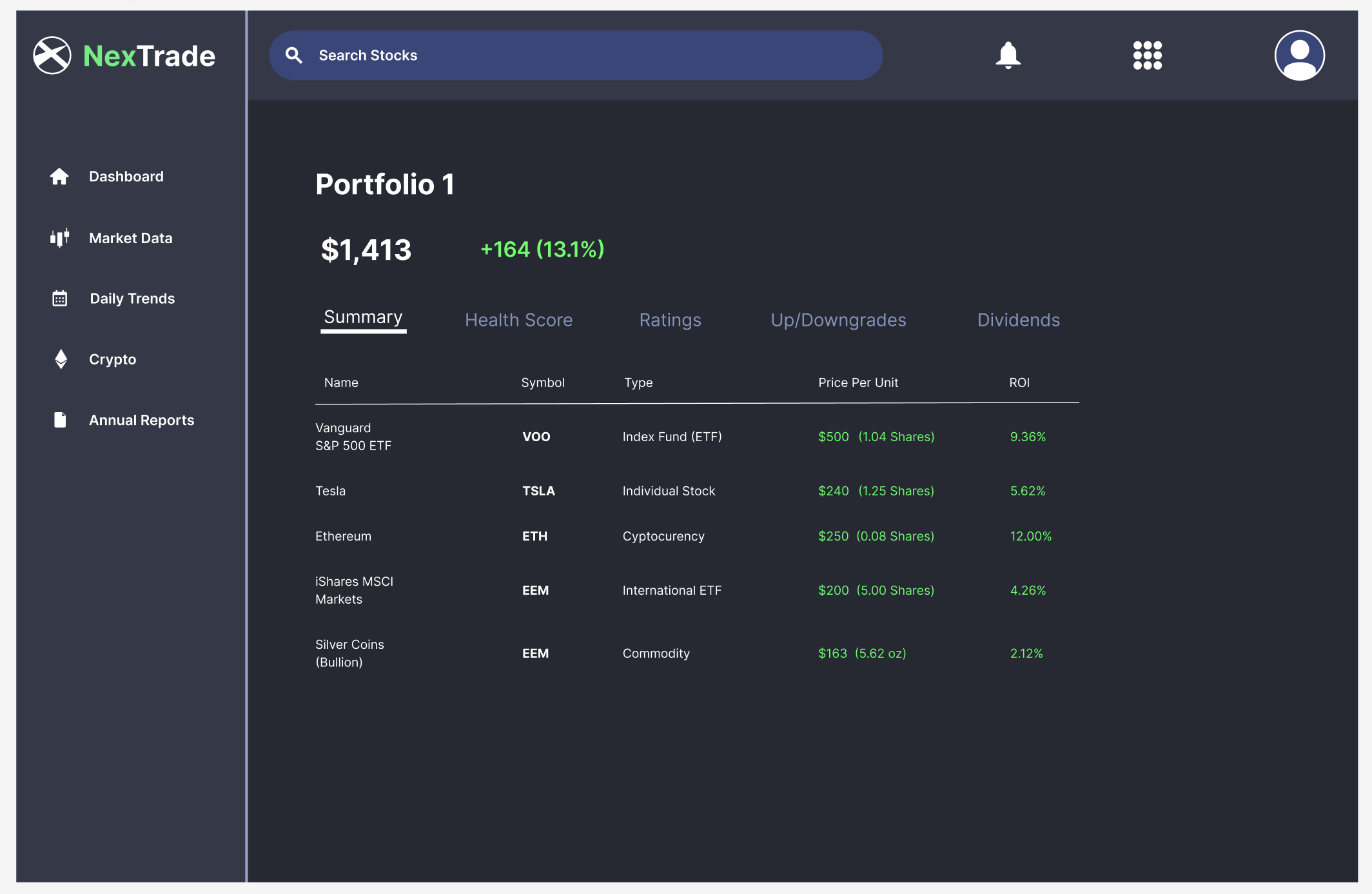
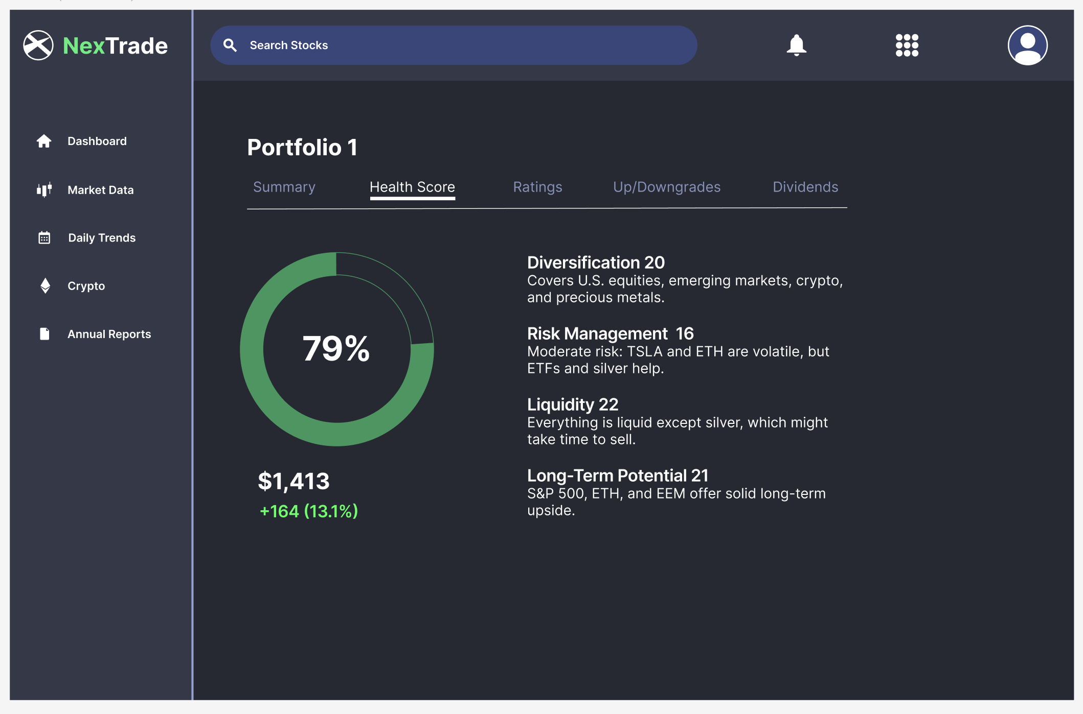
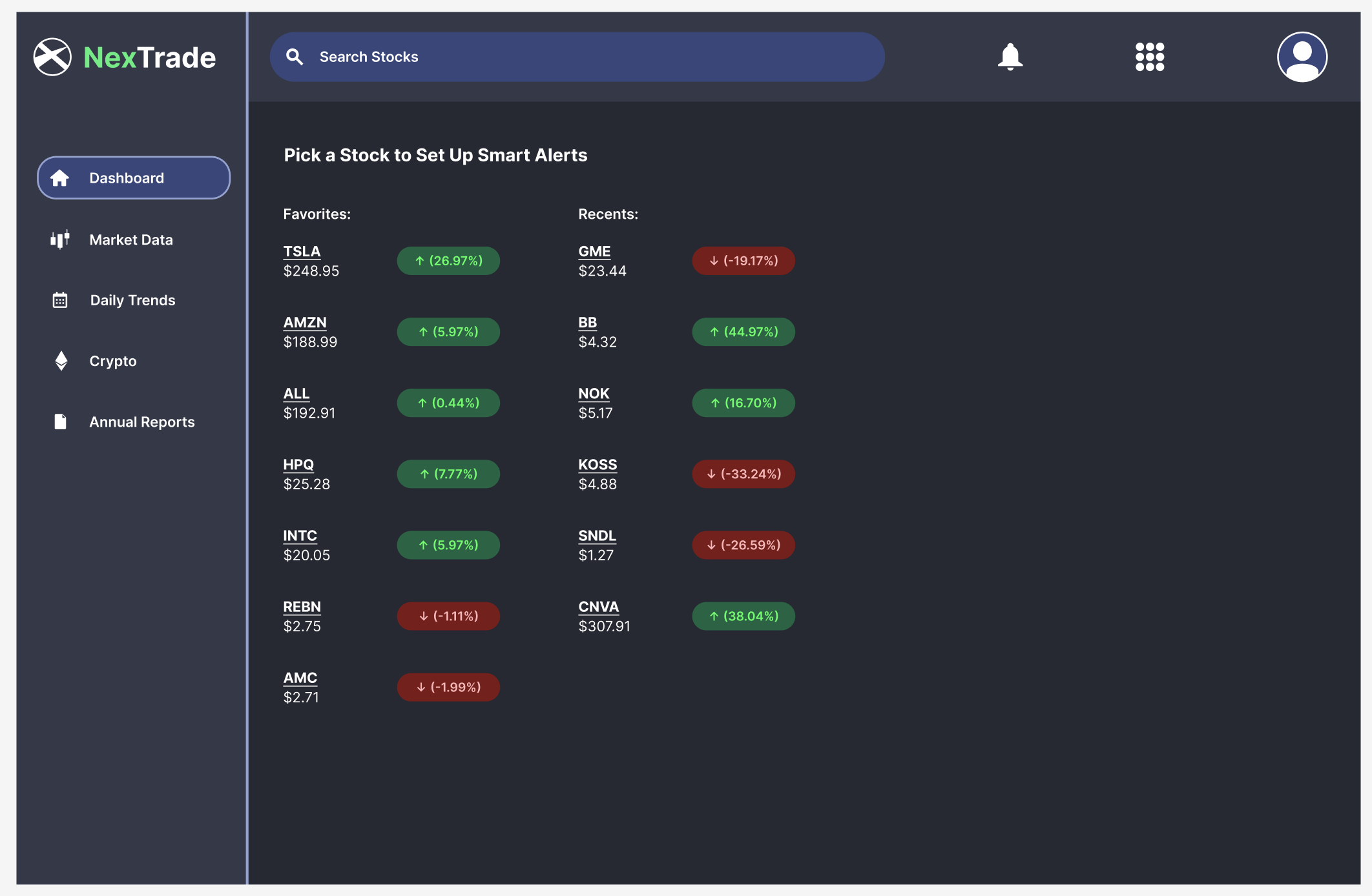
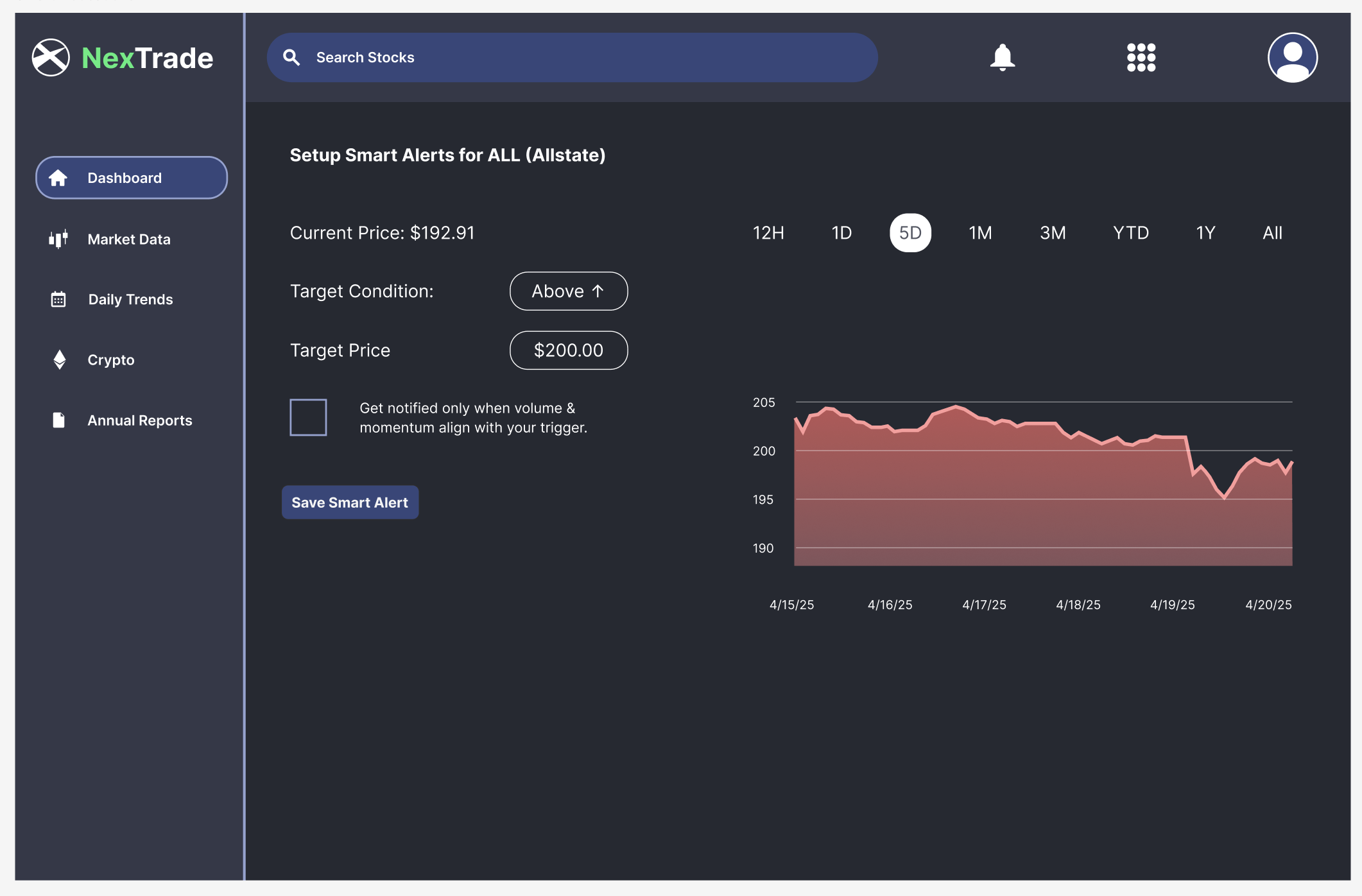
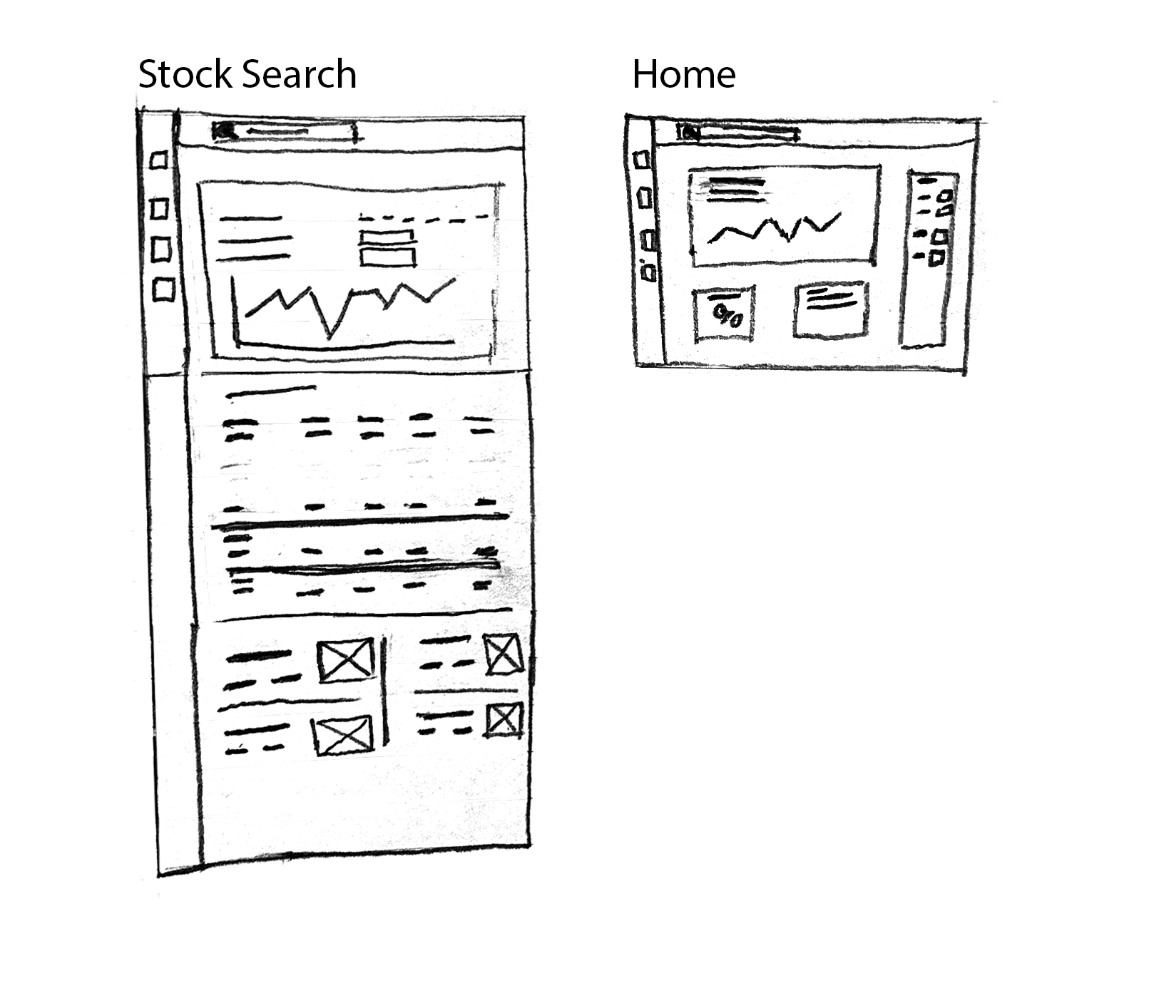
This concept project reimagines a financial dashboard with a data-first design approach, inspired by institutional tools like Bloomberg Terminal but tailored for modern usability. I noticed that most consumer finance platforms, like Google Finance, Seeking Alpha, or MarketWatch, overemphasize news content, while pushing actual trading data and portfolio information to the side. My goal was to flip that model by designing an interface that prioritizes clarity, visual hierarchy, and actionable insights. The project reinforced an important lesson: good UX doesn’t mean less information, it means better structure.
Goal Statement: Create a user-friendly financial dashboard that puts data first.
Clear visual hierarchy to guide focus
High color contrast for fast scanning
Consistent spacing and modular layout
Easy to understand at a glance, even with dense information